For Goodness Sake
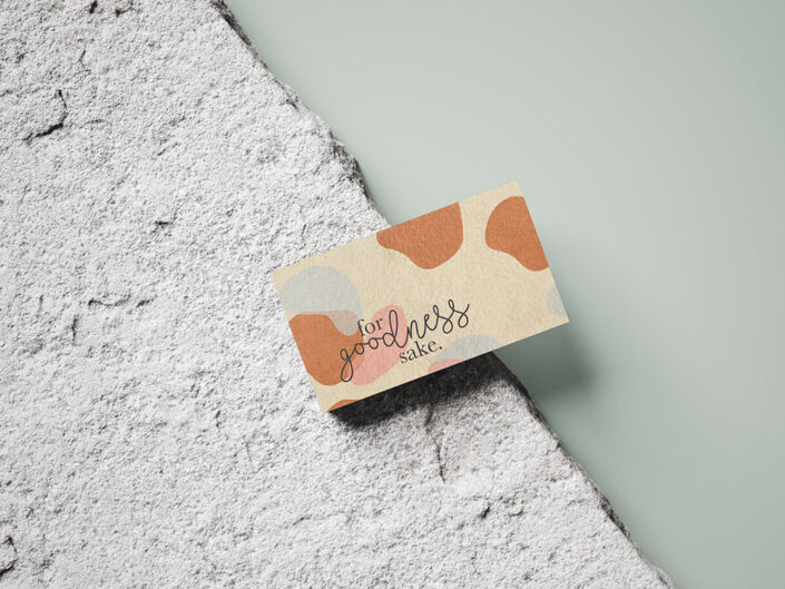
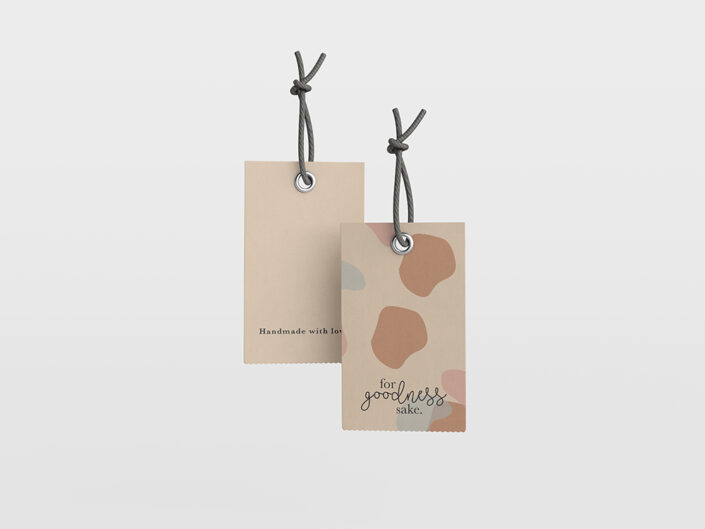
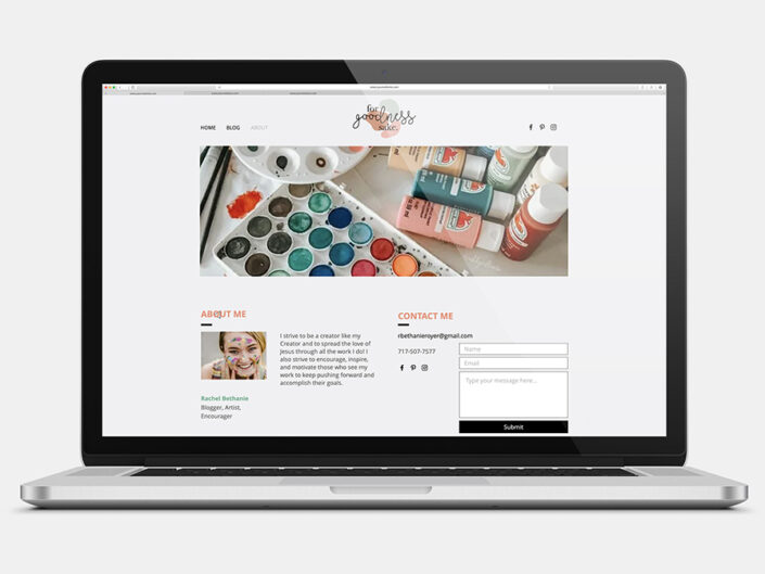
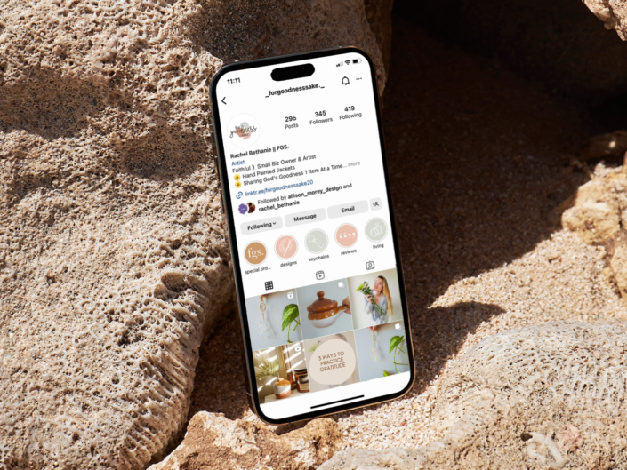
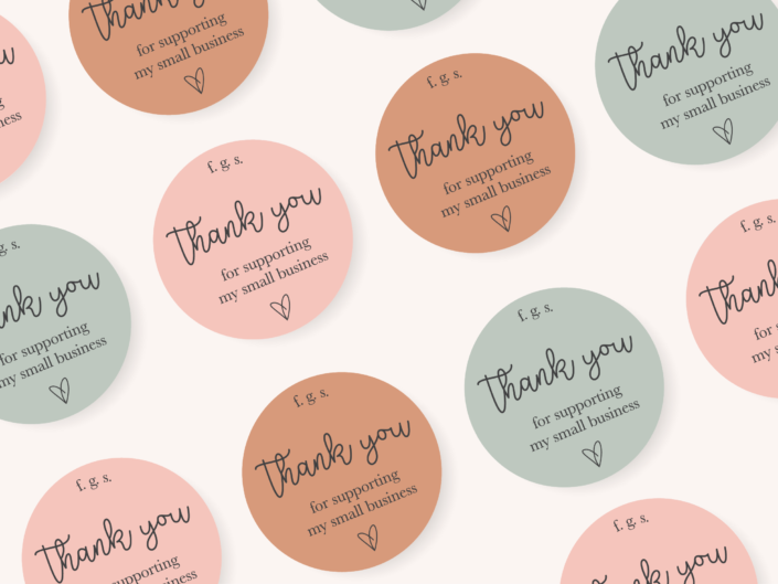
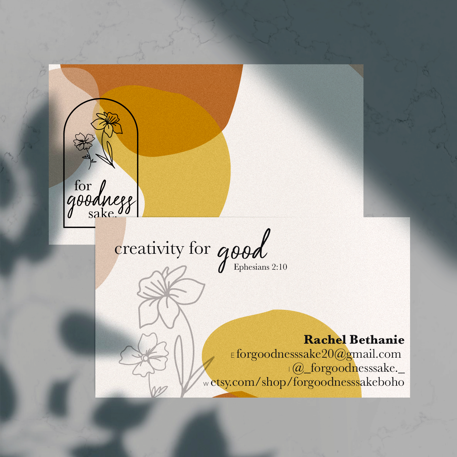
Rachel came to me wanting a logo for her small pottery business. Upon further discussion, the project grew along with the creativity of her vision. A simple logo turned into a minimalist brand that included stickers, a business card, and a full-color palette.
Inspiration was gathered from Rachel’s love for the outdoors and the natural colors of clay. We wanted the logo to symbolize the messy process that leads to the finished pottery. The abstract shapes were then made into a pattern that can be used as a backdrop or space-filler in other designs.
The name “For Goodness Sake” came from Rachel’s faith. She has always been inspired by Christianity and wanted to represent the good fortune within life through her artwork.
Rebranding
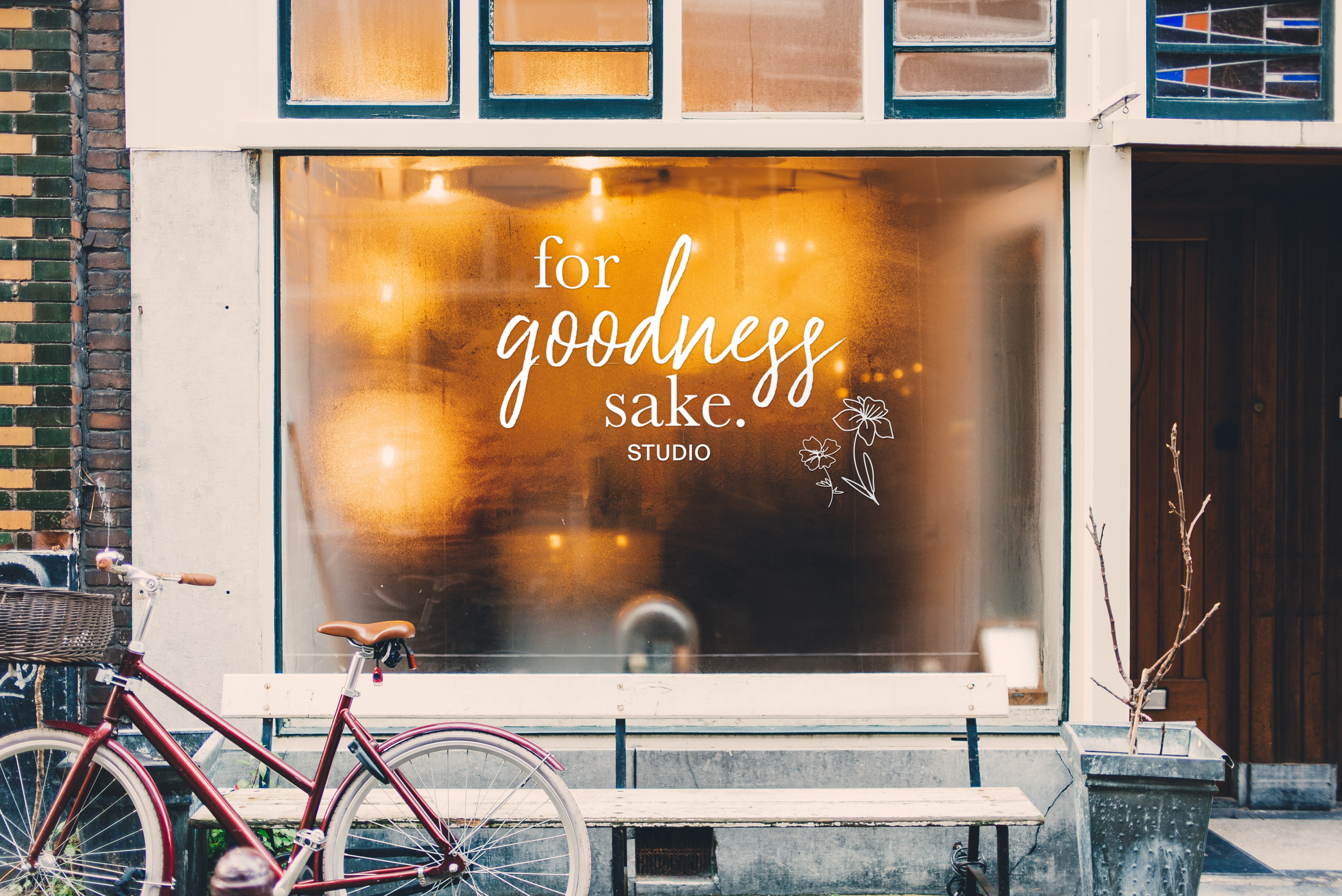
As all creative minds do, Rachel evolved within herself and her business. A year or so after the first branding was completed, she came back wanting to revitalize her look. Keeping the colors natural, we embraced the terracotta and a warmer palette. The goal was to keep some of the abstract shapes already created but give them structure. The logo achieves this by including a border and tangible objects within. The flowers follow her love of nature and harken back to the natural birth of clay itself.
Brainstorming and working with a fellow creative on something so meaningful not once, but twice, was such a joy. Seeing a company evolve over the years shows growth and continued passion – things I wish to see in every client.
COMPLETED: 2020 & 2022
DESIGNED: Allison Morey
CLASSIFICATION: Branding

