
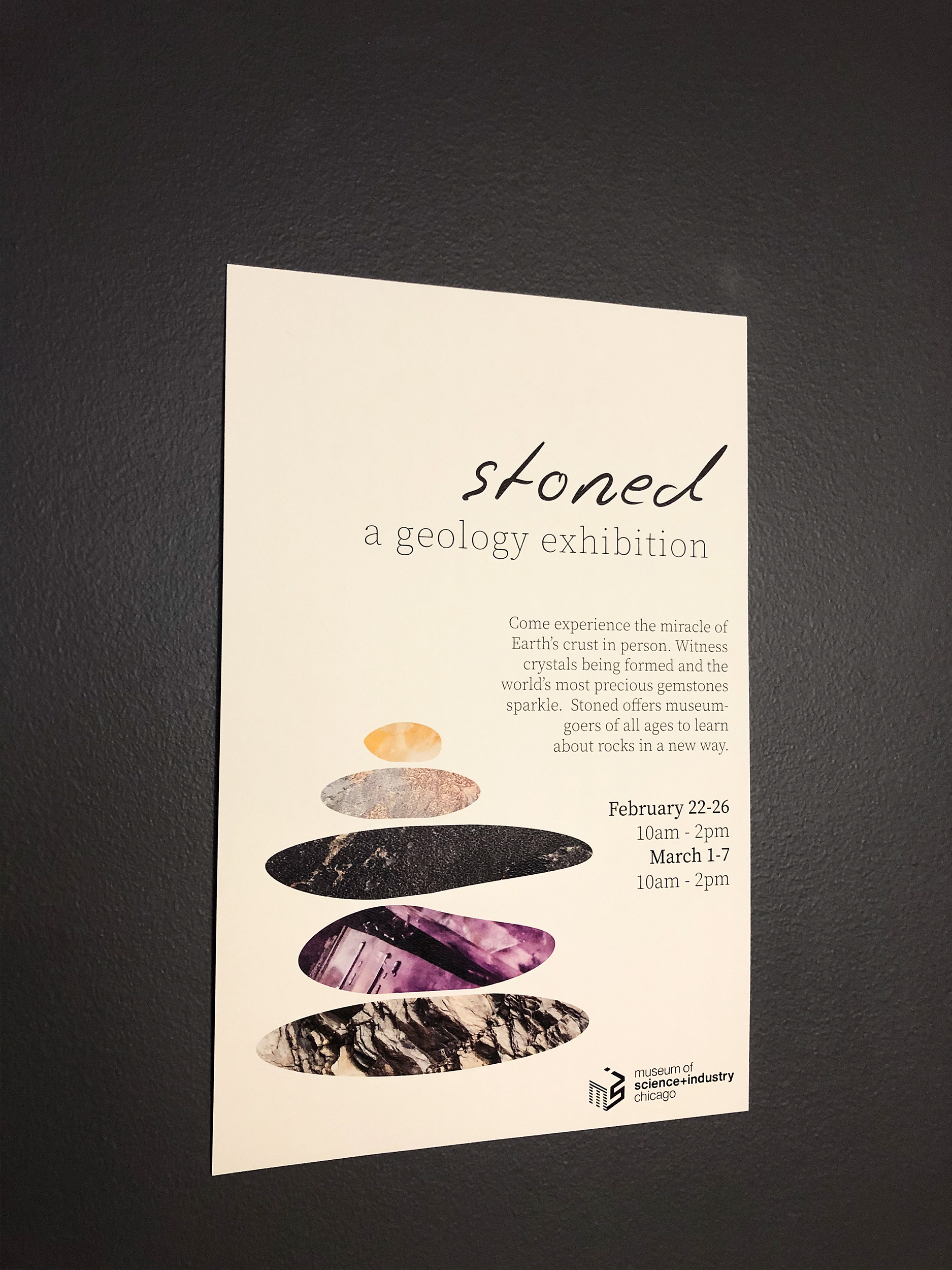
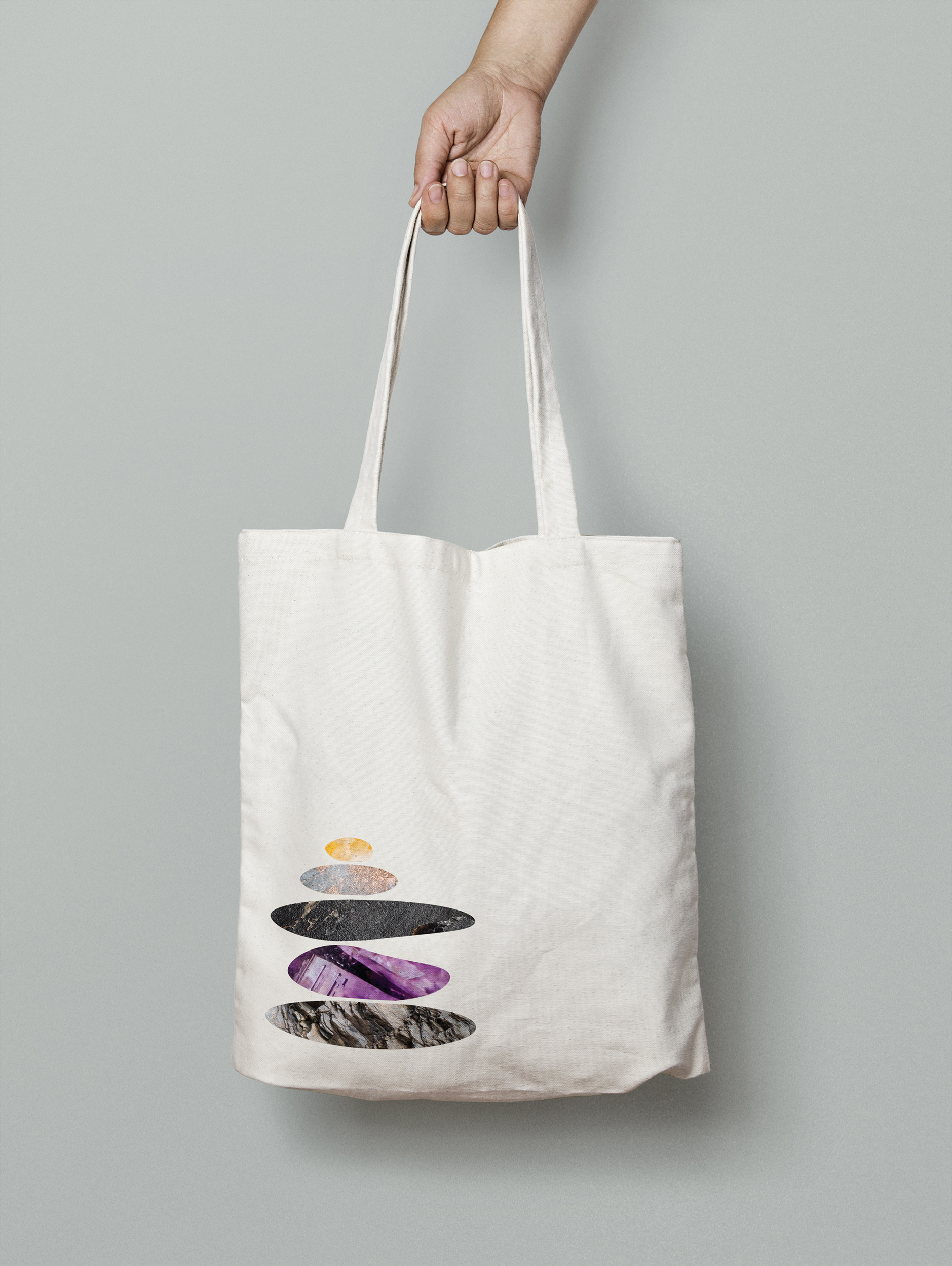
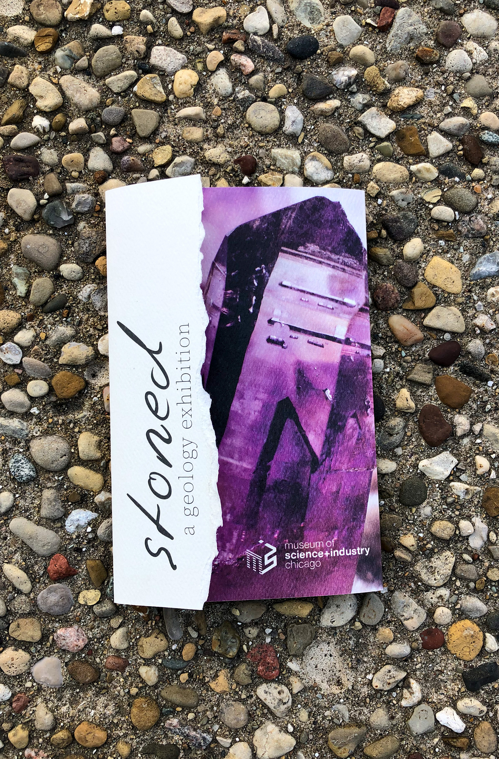
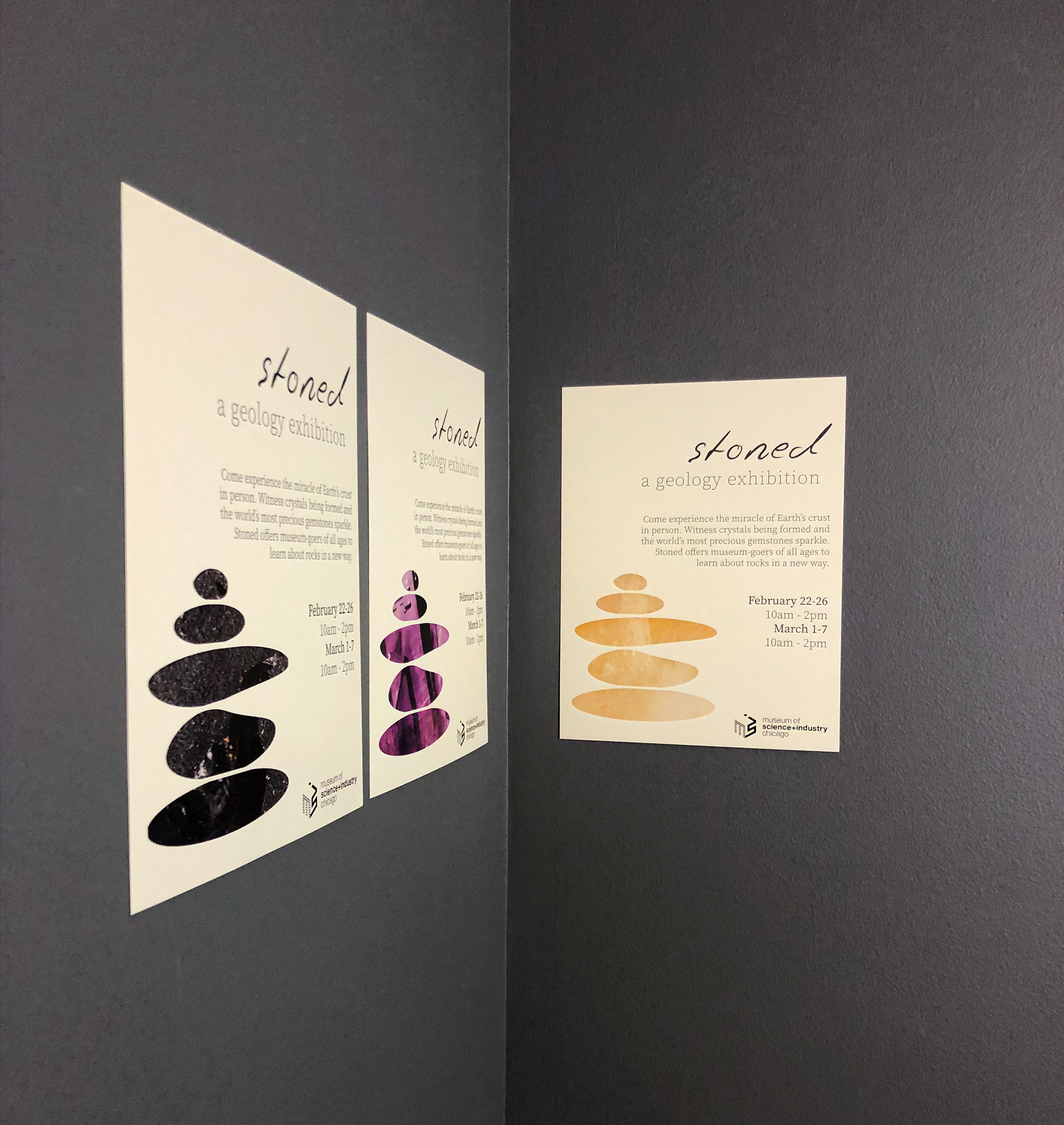
Stoned
Stoned is a traveling museum exhibition that is centered around both the myths and facts of gems, rocks, and crystals. The typeface, textures, and exhibition name were chosen to bring a younger audience (ages 14-25) away from their phone and into the museum. The name “Stoned” makes a pun toward referencing marijuana and pot-head culture – something “hip” with the modern generation. The logo’s textures invoke a tactile interest – viewers want to pick up the brochure, poster, etc. and tough it/experience it. All paper media was printed on a high-tooth paper to mimic the texture of the rocks in the gallery.

Kiosk App
The kiosk app was created to keep the targeted audience engaged while walking through the exhibition. It can either be accessed through the museum website and downloaded onto the viewer’s phone, or physically flipped through on a standing kiosk located throughout the gallery space. As museum-goers browse the beautiful gems, crystals, and rocks that surround them, they gather more in-depth information through articles and info-graphics.
To learn more about the Stoned app, visit https://www.behance.net/gallery/93734849/Stoned-Museum-Kiosk-App
COMPLETED: 2019 DESIGNED: Allison Morey CLASSIFICATION: Design, Typography, Branding