
Strategic Brand Builders
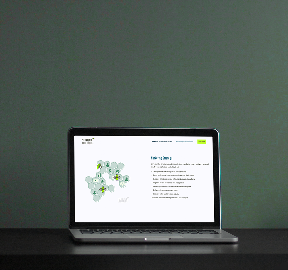
While working with NYB Creative, a marketing agency, the company went through a complete rebranding. I was lucky enough to have a large role in this process. With the help of my design team, we were able to create a new logo, website, t-shirt, icon set, and MORE! This was such a fun project to work on because we were not only the designers but also the clients. I saw the process from start to finish.
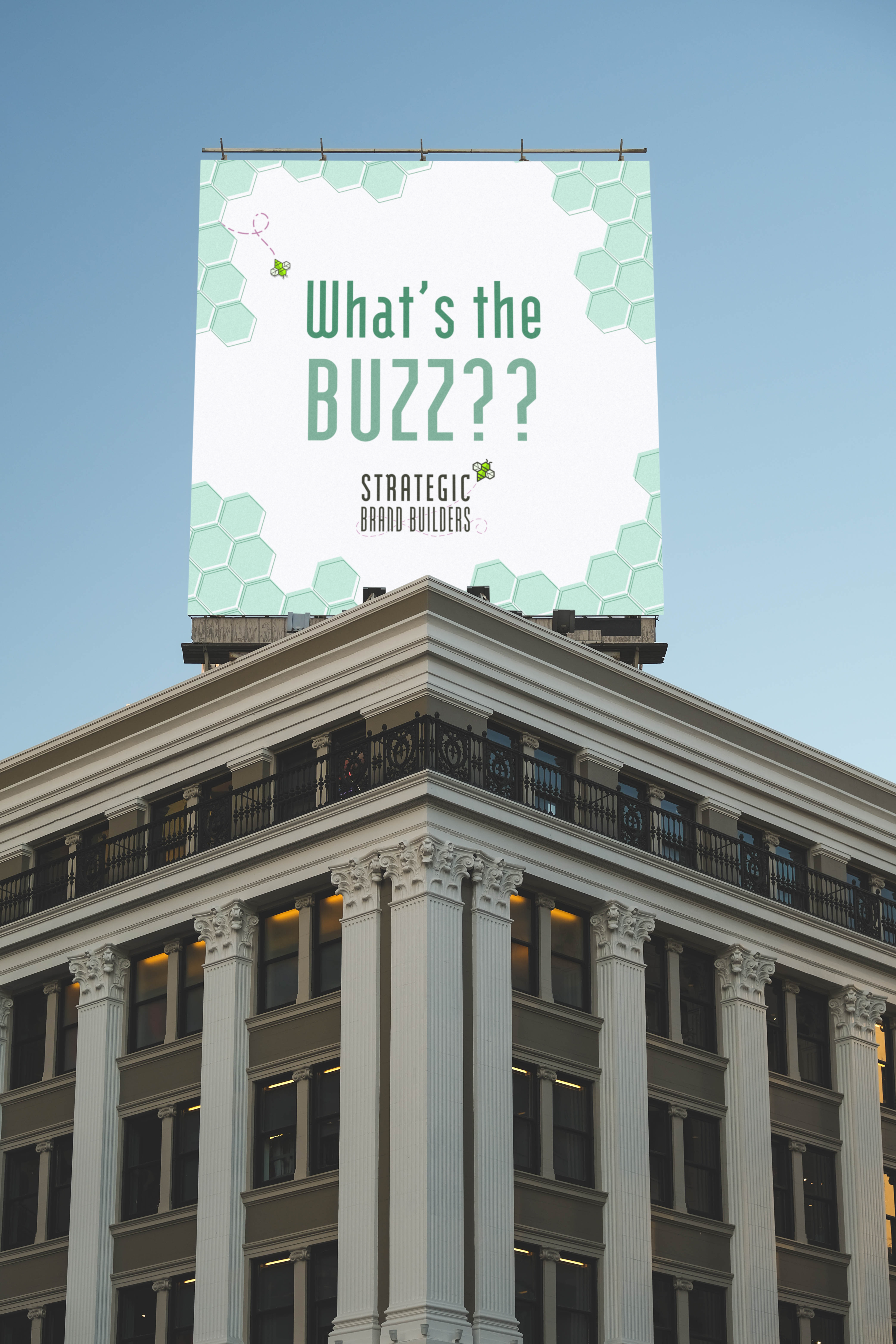
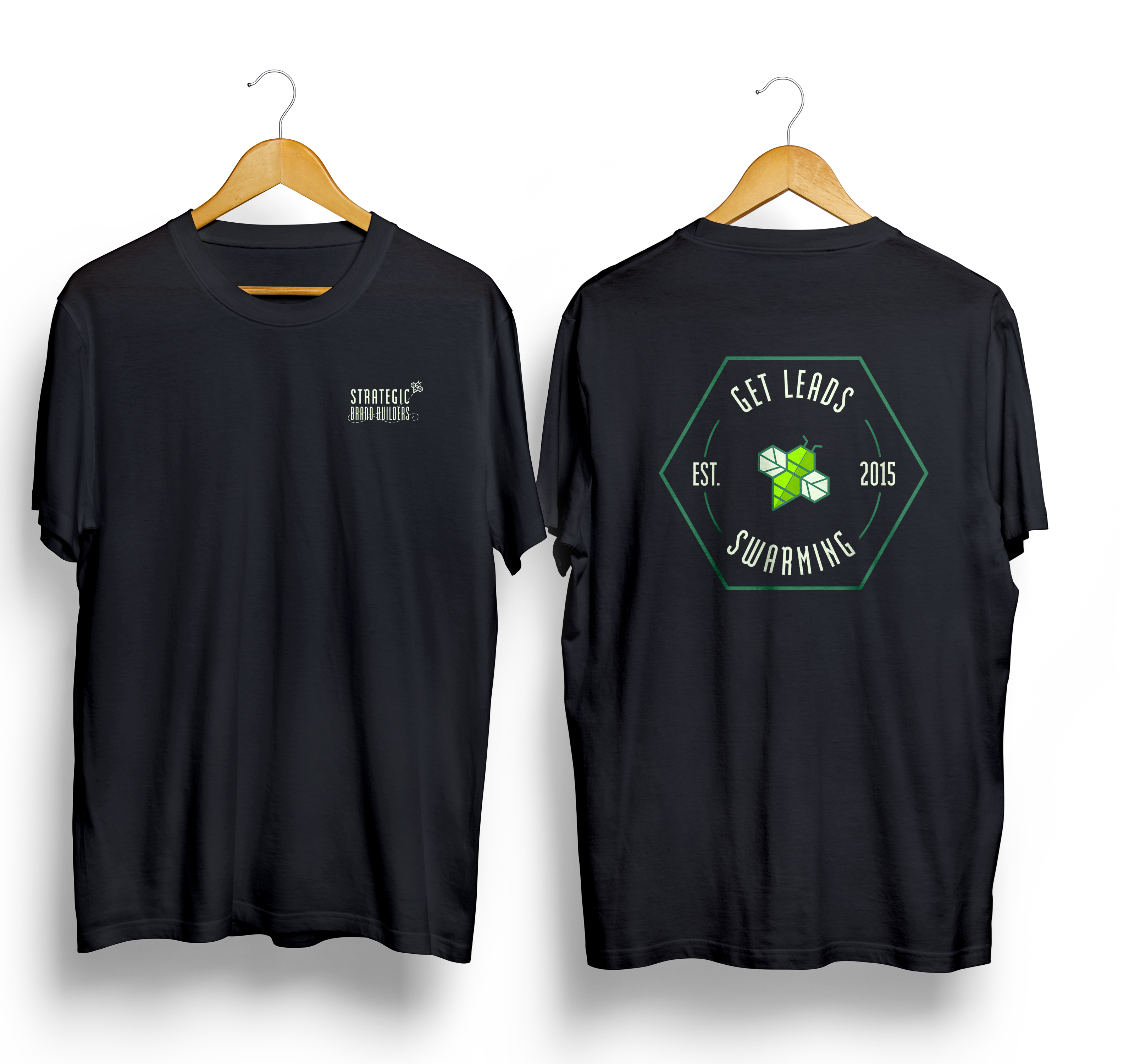
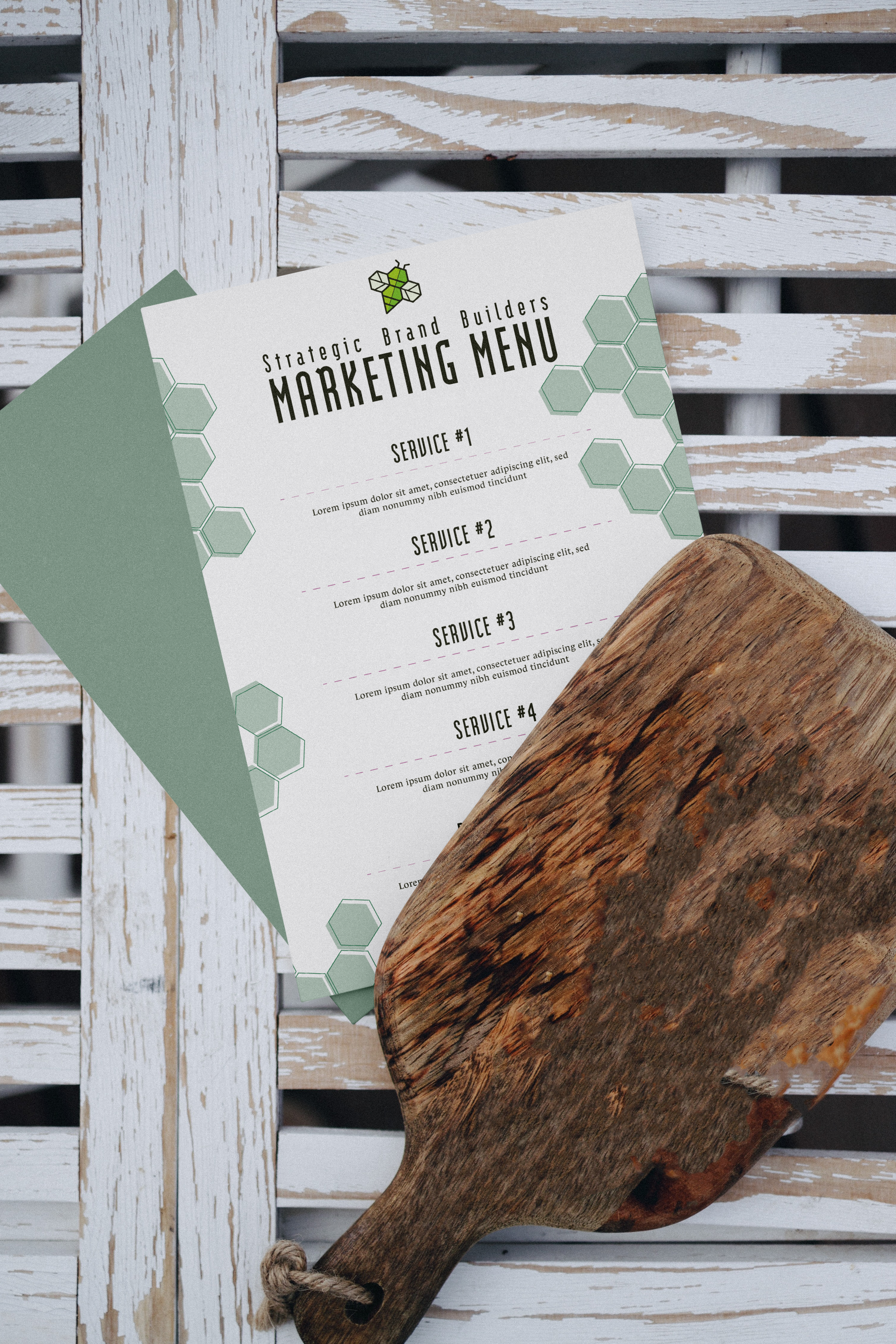
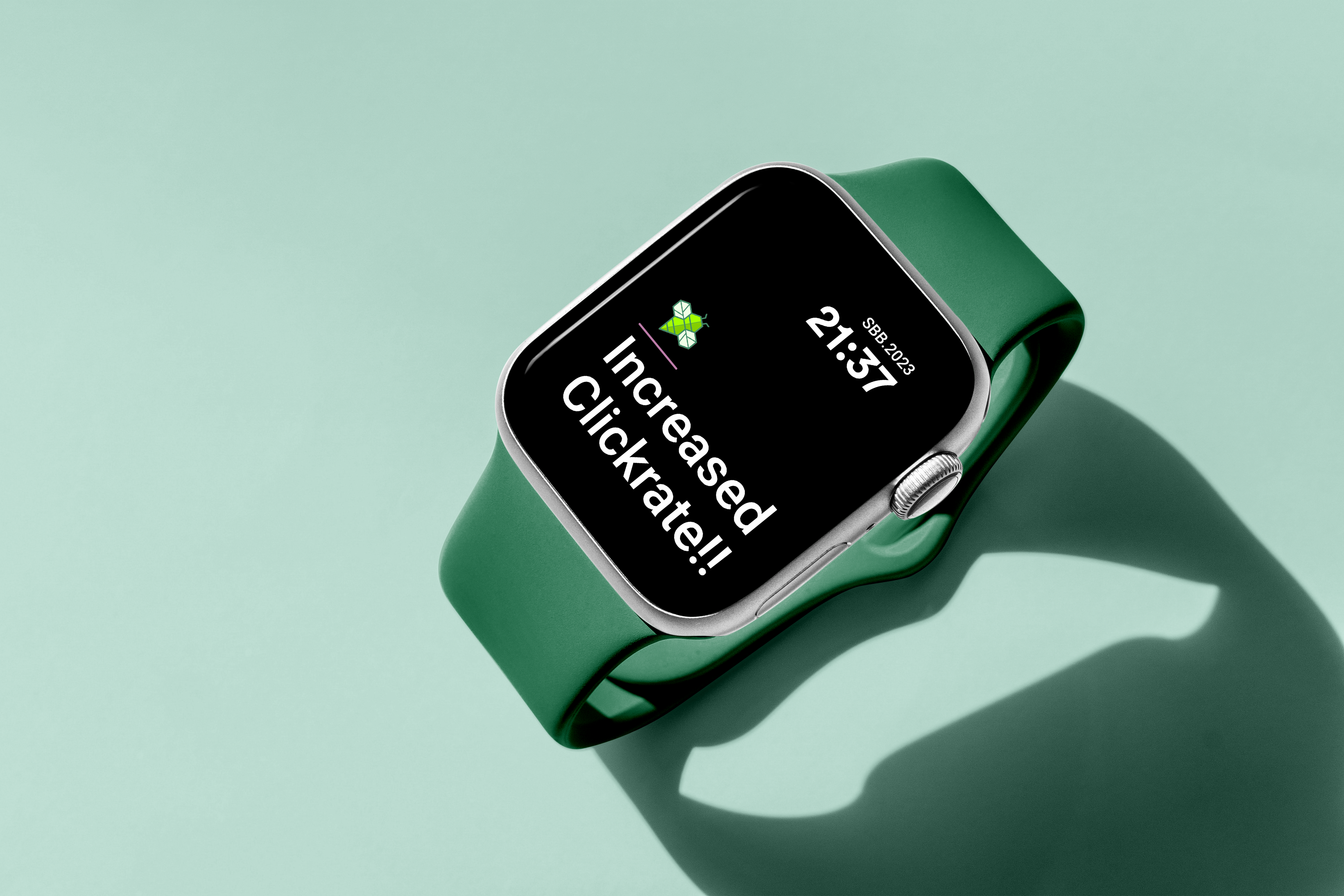
It was important to NYB to stand out as something different – not your usual marketing. Casual meetings in t-shirts, honest conversations, and impressive results. Now known as Strategic Brand Builders, NYB took on the motif of a bee to represent the importance of a team and hard work. The shape of the honeycomb comes into play as well – hexagons are sturdy, but even more so when put together. You see this used in illustrations and patterns throughout mediums. We wanted to stand out, however, since bees are popular in culture nowadays. Our neon color palette catches the eye and presents the artistic side of marketing.
COMPLETED: 2023 DESIGNED: Allison Morey & SBB
CLASSIFICATION: Web Design, Branding, Illustration, Iconography